 A few typographys I made in illustrator. The first one is text that are curving along a path. Its using papyrus font. The second one is a 3D & hollowed-out with a sligh rotation. The last one is using a gothic font and is over a gradient.
Archive for October, 2008
Typography
Posted in Uncategorized on October 31, 2008| 1 Comment »
A word is worth a thousand pictures?
Posted in Uncategorized on October 27, 2008| Leave a Comment »
The old adage “a picture is worth a thousand words” I think can be seen from the other perspective. In all respect to the visual image, I think a word can be worth a thousands pictures. When I say the word “you”, what comes to mind: hair/eye color? Certain past experiences you’ve been through? Certain personality traits or things you are interested in? You had at least some images flashing through your mind. The mind is an amazing organ that paints pictures of characters, enviroments, entire worlds almost instantaneously all with a few words. Tolkein is one of my favorite authors and his habit of describing every rock and tree and what kind of moss grows maybe a on the extreme side. I’ve had several friends say they couldn’t stand that, that it was too slow or added filler. I personally enjoyed that aspect of it though. The descriptions helped me picture what he was trying to convey and for someone who hasn’t seen or experienced what some obscure plant looked like was really helpful.
Picture the Other
Posted in Uncategorized on October 24, 2008| 1 Comment »
Lonely & Abandoned
Posted in Uncategorized on October 19, 2008| 1 Comment »
These are two images of an abandoned Japanese Love hotel (I’ll leave it to your imagination about what happens there) but that aside I found the photographs themselves rather appealing. They have an aura around them of mystery, almost a little spooky with the dead vines on the wall and the rundown look. I like exploring places and this sparks those explorer tendencies, almost inviting to see whats inside or what secrets it may be hiding.
For original source and more pictures click here
Inanimate Letter 5
Posted in Uncategorized on October 14, 2008| Leave a Comment »
Ansel Adams
Posted in Uncategorized on October 14, 2008| Leave a Comment »
water
trees
mountain
I was looking for famous artists when one of our teachers mentioned Ansel Adams. I instantly thought back to the first time I heard of him. It was several years ago; I was visiting many of the famous National Parks with my grandparents and a lot of the time I’d see these pictures in the gift shops (costing and arm and a leg) by this man named Ansel Adams. I asked about him and leaned he was a famous photographer whi did virtually all his photos of nature and they were most famous for being black and white. I didn’t appreciate them back then cause at the time they were boring to me, as it might be with any 12 year old boy. Being older now, I can appreciate his unique style of using many different shades of black and greys. The certain camera angles and time of day he used to capture different “moods” of the landscapes.
Frilly Typography
Posted in Uncategorized on October 11, 2008| Leave a Comment »
Was surfing the Internet when I came across this interesting site and it got me thinking about art and text. The two for me seemed to be totally separate from one another for a long time, maybe I just didn’t think about it. I personally don’t have a problem with a combination of that sort and I think it enhances the word/text (whether for advertising, etc), making it more appealing and not so boring. At least for the Phoenician style or western fonts and typography. It even might present a duality with the word meaning one thing while drawn/painted to mean totally the opposite. As I mentioned in a previous post I’m a Japanphile, I find the Asian style of writing interesting. Its seemed to have maintained the original form of pictography writing in the past (hieroglyphics, cave paintings, etc) but became more refined as words but still has traces of the original drawings that were used to mean certain things. If I memory serves, I remember seeing a chart of the Phoenician alphabet (western) that it was more like the pictography form in the beginning but became increasingly more simple over time until what we have is the romanization of it.
Trying to tie this together I guess what I’m trying to say is I think its interesting that the artistic typography seem to be the western alphabet reverting (at least to a degree) back to its pictograph roots.
Inanimate Letters 4
Posted in Uncategorized on October 10, 2008| Leave a Comment »
Inanimate Letters 3
Posted in Uncategorized on October 10, 2008| Leave a Comment »
This is the rotational arm that holds my monitor. I’ve rotated it so it looks more like a T. And if your wondering why all these are near my computer, its because I don’t own a camera so I’m using my webcam.
Inanimate Letters 2
Posted in Uncategorized on October 10, 2008| Leave a Comment »
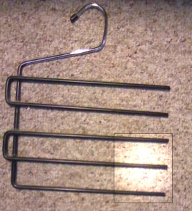
This maybe stretching it a little. I tried to make it more by itself using some of the lighting effects in Photoshop.


